The live product is currently down; links are for reference. I worked on it as a full-time contract for ~3 years.
Curious Me was an anonymous social network built around location instead of followers. Share a thought, see what people nearby are saying, and join a conversation without building a public identity.
I spent over three years leading frontend development across the app, public web experience, and admin tools. Working with design, I built components and interaction behavior, guided the frontend team, and owned reviews and releases. Here are a few details I particularly enjoyed working through.
Joining an anonymous conversation
Anonymity made something as familiar as mentioning another person a little different.
The person who created the post appears as Author in their own comment thread. Other participants receive random two-word aliases. Mention suggestions only include people already in the conversation; the author doesn’t need to appear because a comment already notifies them.
Type @, choose someone in the conversation, finish the reply, and post.
Those identity rules carry through posts, replies, reposts, and pinned comments. Shared components handle the common structure, while each context needs its own presentation. Connecting lines help people follow replies. Removed comments keep their place so the surrounding conversation still makes sense.
The composer has its own sequence to get right. Typing @ starts loading the available participants. The loading rows follow the suggestion list’s spacing, keeping the picker steady as its contents change. After publishing, the comment reveal draws attention to the reply joining the thread.
I wanted that sequence to be easy to follow from the keyboard or pointer: choose someone, keep writing, post, and see where the reply belongs.
Underneath it, mentions use the Draft.js content format shared by web, mobile, and backend. Working on the editor meant preserving that contract while paying attention to what happens on screen.
Keeping search steady
Search can return posts, hashtags, and rooms. Grouping them by type lets people scan for the destination they want before reading every result.
Debouncing requests takes care of unnecessary network calls. There is still a visual question to answer: what should happen between typing a query and seeing its results?
I focused on keeping the query visible and the result panel steady. Loading placeholders follow the result list’s spacing, giving the incoming content a familiar place to appear.
Searching for “Jakarta,” moving through grouped results with the keyboard, and closing the panel.
Keyboard behavior follows the same idea of keeping people oriented. Arrow Up and Arrow Down move through results with a visible active item. Enter selects it. Escape closes the panel. Clear removes the query while keeping the search interaction available.
I liked working on this because so much of the decision came down to what should stay still. Keeping the query and panel in place makes the changing results easier to follow.
That is a useful question whenever I work on loading states now: how much of the interface can remain familiar while the data changes?
Opening media and finding your way back
A post card is a large navigation target. It also contains links, buttons, selectable text, and media.
That creates some surprisingly easy mistakes. Opening a gallery could also open the post. Selecting text to copy could take you to another page. I fixed those boundaries across the content controls so each action kept its own intent.
Opening a gallery from a post, moving between images, and returning.
The media system supports images, galleries, GIFs, video, and audio. Images use aspect-ratio handling and blurred placeholders. Playback responds to viewport visibility, with position preserved between related surfaces.
The lightbox also needs to work across very different amounts of space. On desktop, there is room to retain more surrounding context. On mobile, the media needs more of the screen, and the controls need to remain comfortable to reach.
The same gallery in its mobile presentation.
I worked through the framing, controls, and transitions across desktop, tablet, and mobile. Checking the same sequence at each size exposed details that were easy to miss at one window size.
Opening and dismissal belong to that same sequence, including how the transitions respond to reduced-motion preferences. Returning to the post deserves the same attention as entering the gallery.
A post made for sharing
Curious Me also lets people export a post as an image.
Pointing html2canvas at the existing card seemed like the obvious approach. But that card carried interactive controls, responsive styles, and application state. Each variation gave the export another way to break.
I built a second render tree whose only job was to become an image. It handled posts, comments, reposts, audio, galleries, and sensitive-content states with predictable markup. React mounted it offscreen through a portal before html2canvas rendered the PNG.
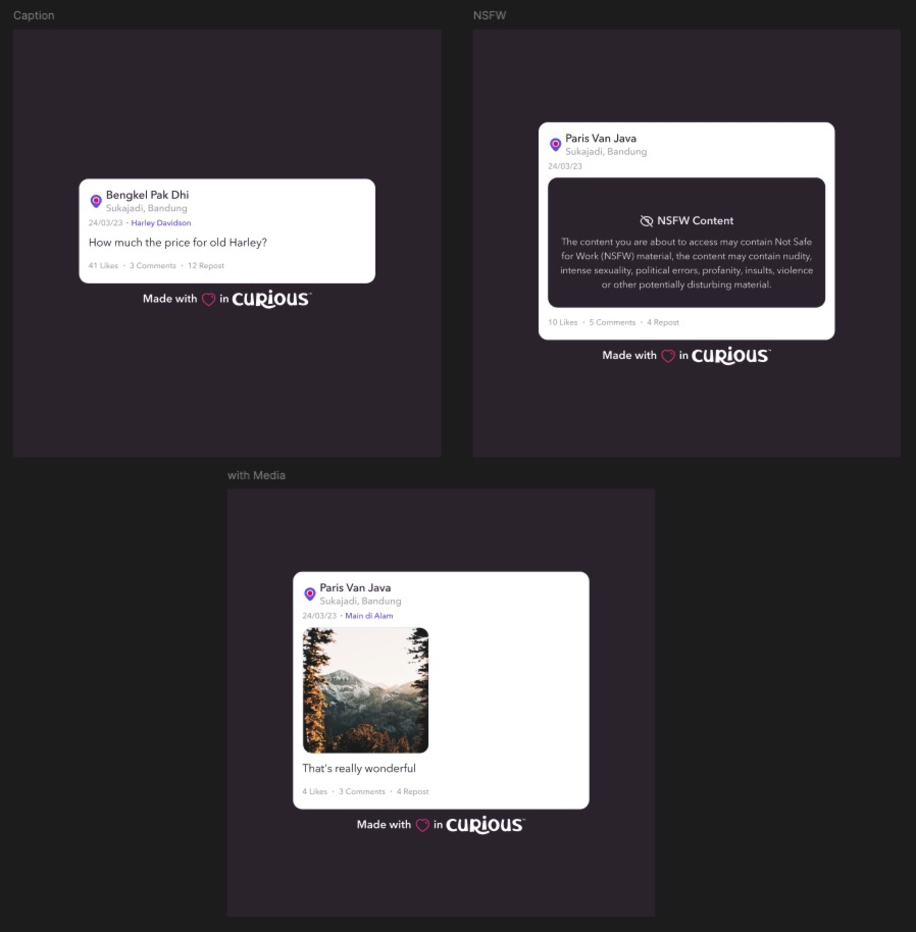
One export system, several content shapes.
Then came the part that looked boring until it failed: downloading the image on a phone.
The download attribute could fail silently in mobile browsers. No file, no error. Since sharing from a phone was the point, I hardened that path by attaching the download element to the DOM, triggering it on the next animation frame, and delaying cleanup.
Giving the export its own representation made both sides easier to maintain. The live card could keep evolving without dragging every interaction detail into the image.
What stayed with me
Curious Me sharpened how I think about keyboard behavior, focus, loading continuity, and reduced motion. They influence how an interaction feels from beginning to end, so I now bring them into the discussion alongside its layout and visual design.
The project gave me practice moving between product rules and implementation details: deciding who belongs in a mention list, preserving that mention across platforms, or making sure opening an image doesn’t accidentally navigate the feed.
That is the work I enjoy most: following an interaction far enough to catch the details people encounter after the first click.